


2018 School Spending Survey Report
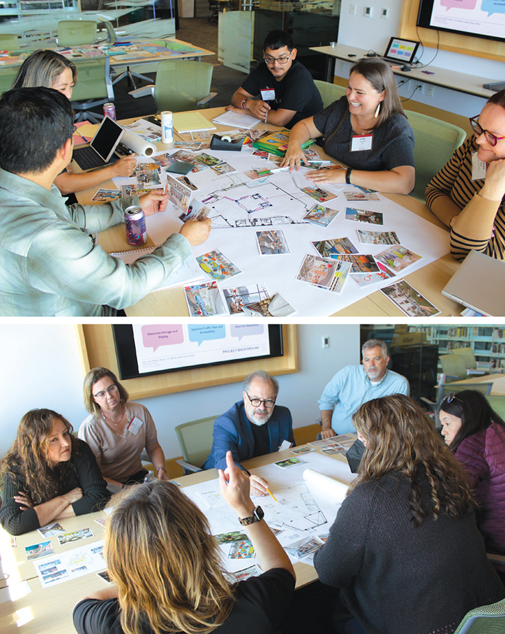
5 Design Challenges from Hayward | Design Institute Hayward 2023
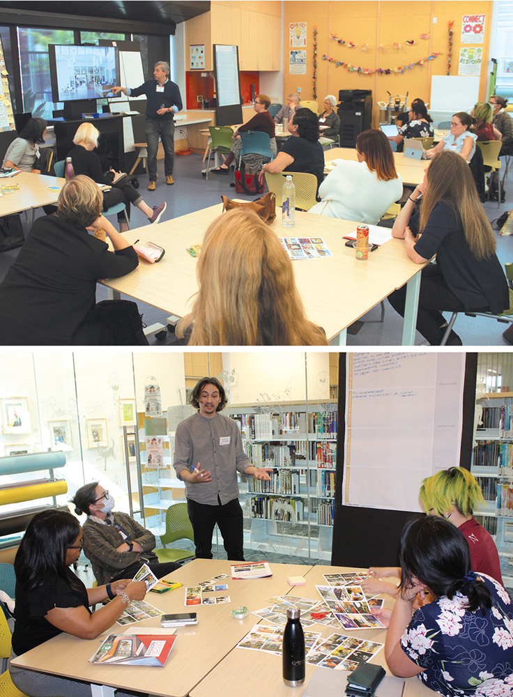
At LJ’s 2023 Design Institute in Hayward, CA, held at the Hayward Public Library on September 28, five libraries in California and New Mexico enlisted architects and attendees to brainstorm on upcoming library design challenges.
Milpitas Library–Santa Clara County Library District CA
ARCHITECT Group 4 Architecture, Research + Planning
THE CHALLENGE The library seeks to reimagine the 4,460 square foot fabric-roofed courtyard connecting its North and South wings to house International Languages, children’s, and adult collections; provide exhibit space for community artwork; and offer family and group seating, with the overall goal of creating a welcoming environment for a diverse, 80,000-resident service area. Areas for redesign include the original classrooms and offices of the historic Milpitas Grammar School—located in the center of the modern 60,000 square foot library—situated around the courtyard.
THE BRAINSTORM Architects began by asking participants to define “inclusion,” to align with the Santa Clara County Library District’s mission statement of “YOU: Belong. Connect. Discover.” The group then broke into four teams, facilitated by members of Group 4 and Shoshanna Francis, Milpitas adult and teen supervising librarian. Each team was tasked with designing around the suggested themes: gathering/celebration, creative lens, connecting, and reading/discovery, using inspirational pictures, markers, and paper. Common ideas emerged, such as using courtyard exhibit spaces to feature arts and crafts, food, singing or dancing, and holidays as shared cultural touchpoints; rotating displays could showcase art, clothing, or historical items from various groups. Dynamic digital signage and display monitors in multiple languages, as well as training for staff, were suggested to help foster inclusivity. Specific suggestions included self-portrait art projects, international Zoom conversation rooms, oral history programs, conversation and play groups, and photo or selfie booths, to help connect patrons of different cultures and generations. Emerging ideas ultimately focused on programming and ways to use the space, rather than how to transform the large courtyard, but the Group 4 team said that they were excited to return to the work of planning armed with fresh inspiration and thoughtful input.—Terina McCrawe
Main Library, Oakland Public Library CA
ARCHITECT WRNS Studio
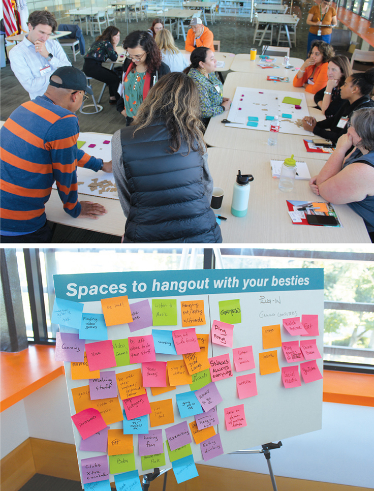
THE CHALLENGE Serving youth from 17 branches across the cities of Oakland, Emeryville, and Piedmont, the Main Library seeks to create a space where teens can be teens. By bumping out a wall and adding about 4,000 square feet to an existing 80,000 square foot facility, the library aims to create a flexible program to support group and individual activities, from study and poetry jams to computer gaming and making. In the process, the library wants to create spaces that can support multiple levels of sensory stimulation, incorporate biophilic design, and create spaces for teens to find their passions, meet their communities, and explore new ideas.
THE BRAINSTORM Participants were given sticky notes and asked to “channel their inner teens” and list activities teens enjoy. They sorted the notes onto three boards, representing three different types of areas: spaces to be alone together, spaces to hang out with your besties, and spaces to feel part of a community. They were then split into three groups; each was given a large floor plan and color-coded felt shapes, representing the three kinds of space, to arrange on the floor plans.
A range of priorities had to be weighed, sparking conversations as animated as the teen users would ideally be. One participant didn’t want teens to feel “bombarded by the rules.” Another wondered if the proposed layout would leave enough room between computers. And the question of making sure that teens had an abundance of titles to choose from vs. reducing collections to allow for more space led to a lively debate. One group ended up focusing on creating open space so teens could see what the library offers, and another on a “coffee shop” vibe with an updatable floor plan. The third didn’t arrive at one focus but had a wide-ranging conversation where each person “learned a lot from [their] partners.” In the end, all agreed that the library’s priorities should shape design decisions.—Michelle Nogales
Octavia Fellin Public Library NM
ARCHITECT Johnston Architects
THE CHALLENGE While just 22,000 people live in Gallup, NM, the town’s library serves more than three times as many residents from neighboring tribal lands, including the Zuni Pueblo and Diné Nation. Twenty years ago, Octavia Fellin Public Library outgrew its 15,000 square foot main facility and reached what was meant to be a temporary solution: relocating children’s services to a repurposed bank. Now seeking to reunite and expand operations, library leadership wants to build a 65,000 square foot structure that would serve as a multi-use regional resource and welcome diverse communities with inviting gathering spaces and a fluid, indoor-outdoor experience. However, the building site presents acute challenges. A block to the north, an interstate highway roars alongside a river that sometimes floods, while immediately south runs a busy railroad and, beneath it, Route 66.
THE BRAINSTORM Participants formed three teams, each receiving a site map, along with markers and colored tiles, sized and labeled for key spaces. They then wrangled with how to provide safe access, reduce noise, and reflect local Indigenous cultures. After arranging the floor plans, the teams presented their results, which shared many elements. To diminish noise and risk, two groups suggested isolating the railroad with a rammed-earth wall. To underscore the cultural significance of the sun, two groups positioned the library’s entrance at the east. One group proposed building a pedestrian bridge over the tracks to improve the library’s connection to downtown, while others expressed doubt that they could procure legal permission. All three teams shaped their plans around an outdoor courtyard, and two created circular libraries. “A seed,” said architect Mary Johnston, as the session was winding down. “It occurs to me now: It should be shaped like a seed.”—Lori Patel
Ontario City Library CA
ARCHITECT Noll & Tam Architects
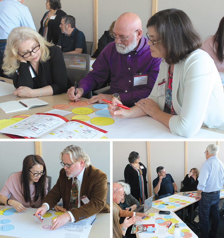
THE CHALLENGE Located between Los Angeles and San Bernardino, Ontario City Library serves a majority Latine and Asian community of about 170,000. Over the next 10 years, thanks to a 1 percent citywide sales tax aimed at infrastructure and community improvements, the library plans to augment its 60,000 square foot main branch and smaller joint-use facility with up to four new branches and unstaffed satellites to meet the needs of its rapidly growing service area. This abundance of opportunity calls for “big-picture thinking,” says Noll & Tam Principal Chris Noll—“designing spaces for the common good.”
THE BRAINSTORM Participants divided into small teams and were each given a persona family—composites of typical Ontario library users. Each group imagined what spaces and programs throughout a new 21st-century library would enrich their persona family’s lives, writing short descriptions on colored circles. These were glued to poster-sized sheets of paper to explore physical layout concepts. Finally, every team presented its proposed design to a hypothetical city council to advocate for a budget to build their ideal spaces. Each group took on the role of “concerned citizen” proposed by Noll, and the ideas that emerged from the consideration of people’s needs ranged from pragmatic to aspirational. These included meeting rooms, cross-cultural programming, and a garden for retirees; vibrant children’s areas close to tech and work spaces for professional families; business resources for young entrepreneurs; adjacent youth, adult, and senior programming for multigenerational immigrant families; engaging evening and weekend services for commuters; and youth, tween, and teen offerings—including snacks and outdoor activities—that can extend afterschool activities to help support single parents. Imagining such open-ended possibilities was both energizing and a bit intimidating, one participant pointed out, and Library Director Shawn Thrasher agreed: “Sometimes more choice is harder than constraints.” —Lisa Peet
San José Public Library CA
ARCHITECT Anderson Brulé Architects
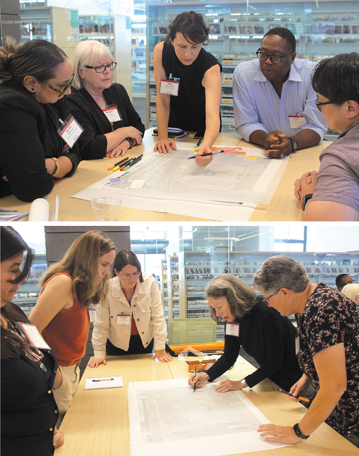
THE CHALLENGE Situated in the joint-use library at San José State University’s campus, the Dr. Martin Luther King Jr. Library’s 8,219 square foot Children’s Room—used by children, teens, and families—was initially constructed in 2003 and updated in 2020 to include the Wee Play Explore Space. This space uses about 1,000 square feet of the total, leaving the rest in need of modernization. The library seeks to enhance flexibility for multifunctionality through structural and furniture features for distinct but mutable zones. By continuing to elevate the themes of interactive play and discovery, and celebrating artwork created by artist Mel Chin, the reimagined Children’s Room would include more opportunities for child-parent interaction, inclusive elements like nursing spaces, and gender-neutral restrooms, while optimizing flow and maximizing storage and display.
THE BRAINSTORM The Children’s Room, while close to an entrance, is tucked away and faces a fragmented layout. The Anderson Brulé team provided examples of flooring, fabric, pictures of inspirational spaces, and layouts to help participants think creatively about the space. Two teams, each with a staff member from the King Library, focused on themes of “gathering” and “connecting.”
Common ideas included connecting spaces for different ages by improving visibility and wayfinding and reorganizing the layout, such as moving restrooms to the mezzanine area to create storage on the first floor that staff could use for programs and seating for parent-child activities. The currently disjointed space could be integrated through updated flooring, paint, and imagery to align with existing artwork, and reoriented to a street entrance for more direct access and to create an “arrival moment” for visitors. Teams discussed moving the program area from the rear to the front, increasing its footprint and visibility. Collection spaces could be organized around the interior perimeter and integrated with reading nooks, rather than taking up valuable floor space. The reimagined layouts all offered increased visibility and functionality, plus stimulating spaces, to welcome and invite users in.—Emily Petty Puckett
All photos by Kevin Henegan

Added To Cart
RELATED


RECOMMENDED

TECHNOLOGY

ALREADY A SUBSCRIBER? LOG IN
We are currently offering this content for free. Sign up now to activate your personal profile, where you can save articles for future viewing
ALREADY A SUBSCRIBER? LOG IN
Thank you for visiting.
We’ve noticed you are using a private browser. To continue, please log in or create an account.

Add Comment :-
Comment Policy:
Comment should not be empty !!!