Looking at Logos | The User Experience
With the monthly report due, a budget to balance, or a program to book, thinking about your library’s logo might not be high on your to-do list. After all, logos can seem like pieces of visual fluff that marketing folks just tack on to an organization. It’s unfortunate that logos often get this sort of treatment, because we should take them more seriously.
Not only does your logo identify your library, it also expresses your library’s values—it elicits a feeling in those who see it. Your library’s logo is a form of communication, and it will communicate different things depending on how it is designed. Below is an example of how different forms of the word library say different things.
First, look at the word set in Bodoni type:
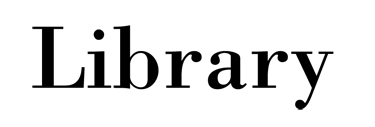
It looks formal, restrained, conservative, and maybe even elegant.
Now, look at the word as interpreted by Michael Bierut for The Library Initiative:

It is fun, bold, and invigorating.
One word, two distinct messages. What message is your library logo sending out?
Creating a logo that effectively communicates your desired message is difficult, especially when graphic elements are added to the mix. The vast majority of library logos include—you guessed it—some variation on a book. This isn’t necessarily a bad thing, but it certainly isn’t necessary either.
Here are some examples of libraries that have taken the effort to design—as in hiring a professional to do the work—visually appealing and meaningful logos.
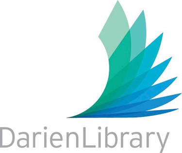
This Connecticut library (below) has a book-related library logo that I like—a lot. The upward motion in the image communicates action and inspires us to aim high. I’m not sure if it is a happy accident, but the negative space at the left of the image and the image itself create a “DL.” Also, the shape of the fanned- out pages are reminiscent of the blue heron statue at the library’s entrance. My one quibble is the intentional contraction of the space between “Darien” and “Library.” I’m not sure if it will age well, but it is easy enough to change.
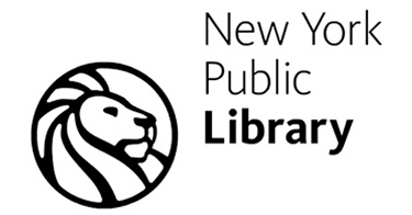
New York PL’s modern update of an old logo is simple and bold. Not only do these characteristics help the logo to communicate a message clearly, they ensure that it functions just as well onscreen as it does in print.
Part of a massive branding campaign and well-executed visual identity, this logo for the Thornton, CO, system speaks of the sometimes complicated nature of information gathering and processing and of endless possibilities. It has a very playful and light feeling, too, making the library seem approachable.

This Ontario, Canada, library’s logo places more emphasis on its tagline—“ideas unlimited”—than on the library’s name. The tagline is clever and lets us understand in an instant what the library is all about; the multicolor treatment it receives here gives it a futuristic air. I can easily imagine this logo on a bus stop advertisement or a T-shirt.

Strong logos become even more powerful when they get put to use as part of a larger visual identity. A well- crafted logo can work on a library’s cards, brochures, bookmarks, tote bags, signage, website, and more. Reinforcing the library’s presence in this way makes it easily recognizable and instills trust in the institution.
You don’t absolutely need a well-designed logo to create a great overall user experience, nor does having a well-designed logo guarantee that you’ll provide a great user experience. Yet taking the time to create an appropriate and thoughtful logo illustrates that you take pride in your library and think holistically about making an impact.
RELATED
ALREADY A SUBSCRIBER? LOG IN
We are currently offering this content for free. Sign up now to activate your personal profile, where you can save articles for future viewing





Add Comment :-
Comment Policy:
Comment should not be empty !!!