4 Design Challenges from Durham | Design Institute Durham 2023
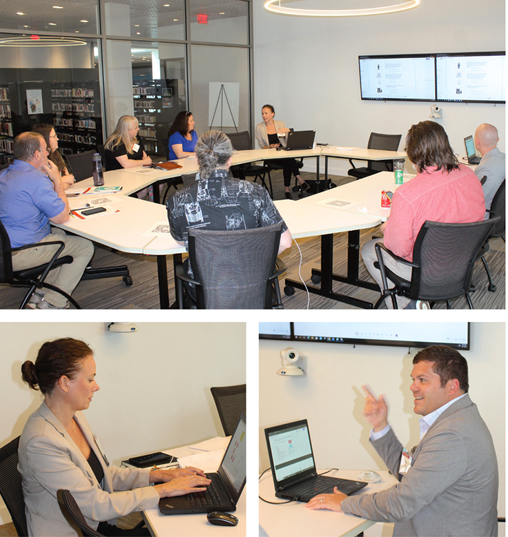
At LJ’s 2023 Design Institute in Durham, NC, held at the Durham County Library on June 1, four libraries in Michigan, Alabama, and North Carolina enlisted architects and attendees to brainstorm on upcoming library design challenges.
Ann Arbor District Library, MI
ARCHITECT GBBN
THE CHALLENGE Ann Arbor is a community in the midst of a housing crisis. The Downtown Library was built in 1959, expanded in 1974 and again in 1991, and no further expansion is possible. It occupies a valuable site in a bustling downtown directly across from a transit hub, surrounded by several midrise housing projects in various stages of planning. The library, an independent government entity, is a well-utilized, award-winning system constrained by the capabilities and spaces of the current downtown building. The elected board is investigating ways to leverage the library’s property value and track record for innovative spaces to develop a new, mixed-used building on the Downtown Library site, including a brand-new facility and ten-plus stories of new housing above, in partnership with institutional and private partners.
THE BRAINSTORM GBBN’s Amanda Markovic and Sean Cottengim led the group in exploring the space potential of such a large project through the eyes of three personas: a frequent library user, an occasional library visitor, and a resident of the new planned housing above the library. As participants talked through questions each persona might have about the project, Cottengim sketched schematic design solutions to their concerns in plan, section, and 3-D volume formats.
Frequent library users wanted to be sure that the services and opportunities the existing library offered would be present in the new structure, and didn’t want to have to travel through “other stuff” to get to their library. Occasional visitors wondered if their usage might be disrupting other library functions or require them to awkwardly navigate spaces where activities were in progress. Residents were concerned about their access to their homes and the amenities of the housing element of the development, or the possibility that their lives could be disrupted by library events. Through this exercise, the group came to a consensus that some possible program elements—such as a partner museum—created more problems than they solved, bringing into high relief the access challenges of a project with such a wide range of uses.—Eli Neiburger
Huntsville–Madison County Public Library, AL
ARCHITECT McMillan Pazdan Smith
THE CHALLENGE Huntsville’s population has doubled over the past 20 years to more than 400,000 residents. The 123,000 square foot Downtown Library, which serves retirees, college students, adults, and those seeking employment and experiencing homelessness, is now more than 35 years old. The needs of the community have changed since the building opened in 1987, and to accomodate changes wrought by COVID-19, a shrinking physical collection, and an increasingly diverse local population, the library seeks to overhaul the building’s function, aesthetics, and circulation flows with spaces such as workforce development training areas, a historical archive, gender-inclusive restrooms and wellness spaces, an automated retrieval handling system, and revamped service points and workspaces.
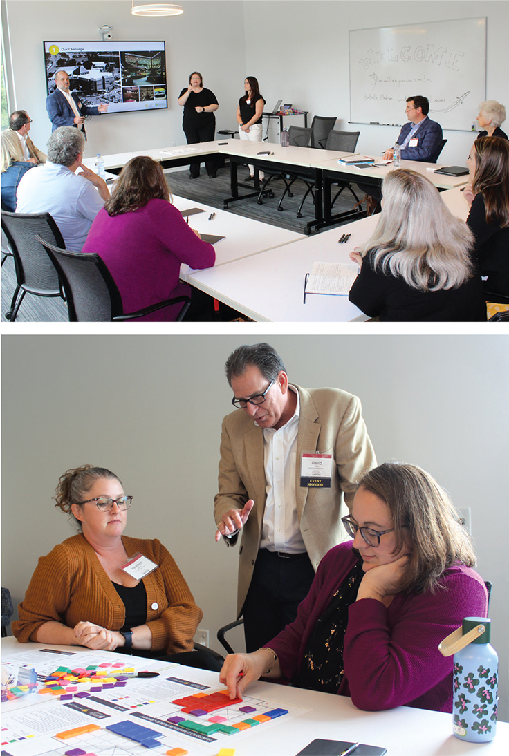
THE BRAINSTORM Participants were split into teams, with each group receiving a gridded floorplan of the Downtown Library’s lower two floors. The architectural team asked each group to create its own plan to arrange the necessary spaces. Colored tiles corresponding to various requirements—children’s, teen, adult, and staff spaces; meeting rooms; technology labs; special collections; and others—were provided, and each team set about strategizing its design concept. Given the building’s irregular shape, with numerous alcoves and abutments, retaining sight lines and accessibility presented a challenge.
At the end of the exercise, teams shared floor plans and thought processes. There were several common threads, as well as compelling unique ideas. For example, while the majority placed the children’s area on the ground floor to reduce the effort of carrying small children and strollers upstairs, one group located it on the second floor to lower the security risk of toddlers wandering outside. The conversations that evolved from participants who represented academic, public, and special libraries approaching the same problem from varying backgrounds helped illustrate the challenges of settling on a unified design concept to accommodate a widely diverse community.—Phillip M. Locey
Lexington County Public Library, NC
ARCHITECT Liollio Architecture
THE CHALLENGE With print circulation increasing, especially through mobile library offerings, and a need to better support children’s and teen services, the library—which serves a population of more than 290,000 and award-winning school districts—seeks to create a designated teen space with a tech/STEM lab. Based on changing service models, there is also an opportunity to redesign and connect the circulation and children’s workrooms and extend the existing garage bay. The library plans to build an auxiliary building of at least 25,000 square feet on acreage adjacent to the current 48,000 square foot Main Library and sees an opportunity to invest in outreach programming by offering an amphitheater, more workspace for employees, and additional drive-through circulation options.
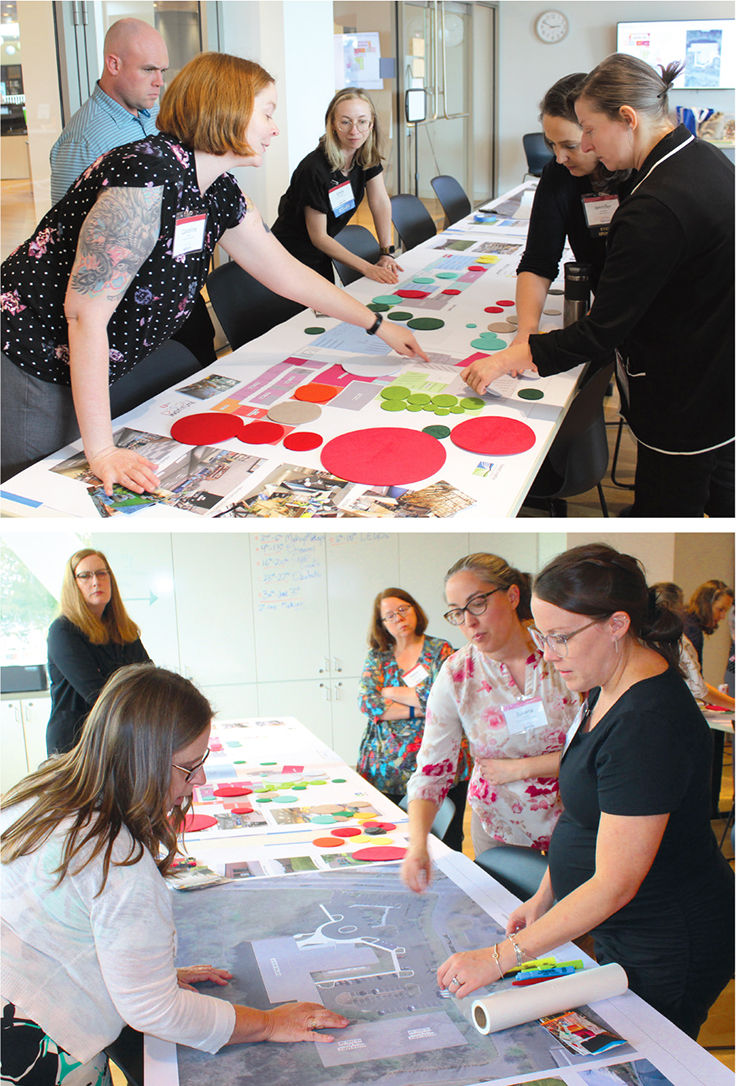
THE BRAINSTORM Given the opportunity to expand into new space, Liollio Architecture and the library wanted to rethink the programming possibilities of the existing building, which houses both county and local services. Using large-scale layouts of current configurations and felted square-footage circles, two teams reimagined how services for the county could be redistributed into a new, functional administrative building. The teams discussed reallocating existing programming to fully serve patrons by moving out functions such as bookmobile bays, a staff training room, and shipping and receiving and administration areas. They then drew on the layouts and used the felt circles to designate more space for the youth area with dedicated programming space, reimagine the entryway and circulation services, create a new and flexible teen area where staff space currently sits, and reorganize adult collections to centralize and consolidate program functions. The new space allocation offers growth and flexibility for the teen and children’s areas and creates a more navigable entryway and circulation path for patrons.—Emily Petty Puckett
Mooresville Public Library, NC
ARCHITECT Little Diversified Architectural Consulting
THE CHALLENGE The Mooresville Public Library has grown steadily, with a new Main Library constructed in 1940 and additions completed in 1964 and 2006. The current layout presents several inflexible challenges: While a striking arched ceiling brings in abundant light, a double line of structural columns through the center of the space creates physical and navigational barriers, and the original building—nestled within the main floor’s footprint—cannot be altered. Services are not distributed intuitively, and separate “battleship” circulation and reference desks don’t offer clear sight lines. Mooresville seeks to redesign the 20,000 square foot main floor, dividing it into zones to create a more functional and supportive user experience. Other wish list items include redesigning the service desks, adding programming and study space, and relocating adult fiction and nonfiction sections and computer workstations.
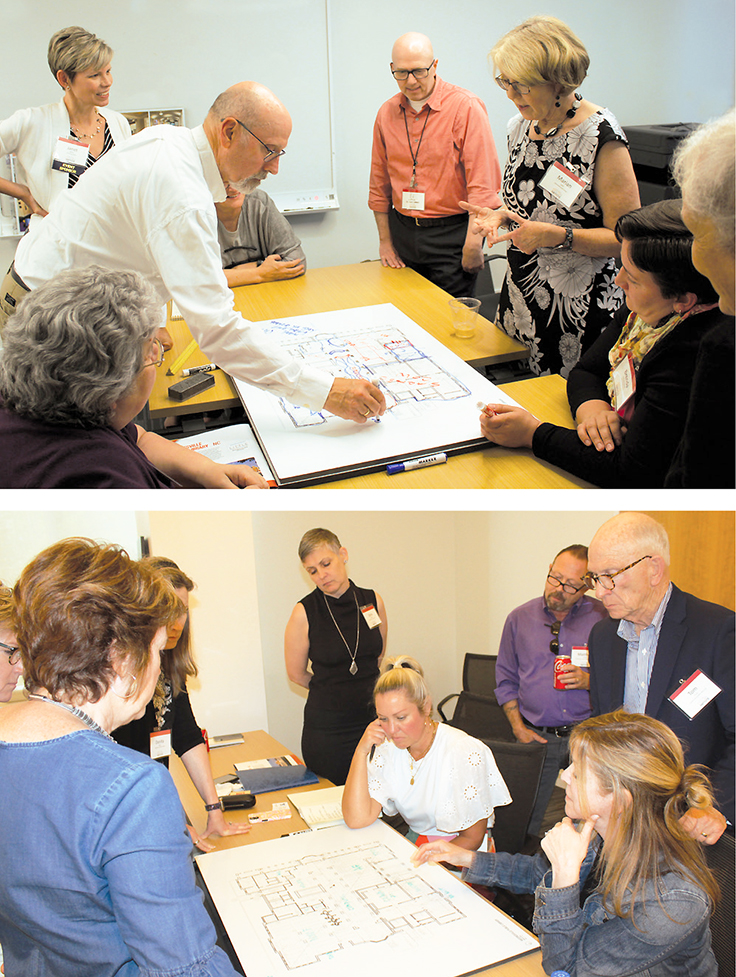
THE BRAINSTORM Two groups were each given large floor plans to draw on with colored markers. Discussion was lively and collaborative, with a few themes emerging. To better accommodate various users, participants suggested distributing services among “noisier” and “quieter” areas. The large, windowed nonfiction section, which gets less use, could be repurposed as teen and YA spaces (a children’s area is located on the lower level). The holds shelf, which blocks elevators, should be relocated, and staff areas enlarged. Service desks could be consolidated centrally, between columns, with half-rounds facing in each direction.
Discussion of the central columns brought out several creative solutions, such as softening the building’s “rigid” feeling by designing a serpentine path from the main entrance, possibly with soft seating in the curves, or bringing in low shelving to take advantage of short spaces. Wraps could be installed between columns to display artwork. An underused outdoor area could be enclosed with lattice or plantings to incorporate programming, reading, or other functions. As the architects noted, “You have lots of options—you’re going to have to prioritize”—but the possibilities represent a good starting point.—Lisa Peet
Photos by Kevin Henegan
RELATED
ALREADY A SUBSCRIBER? LOG IN
We are currently offering this content for free. Sign up now to activate your personal profile, where you can save articles for future viewing


Add Comment :-
Comment Policy:
Comment should not be empty !!!