Merchandising Your Collection
Merchandising can be implemented strategically at libraries, just as it is in retail, and can increase circulation, stimulate robust discussions, and generate foot traffic. To drive circ, how you showcase your materials can be as important as what you buy.
 To drive circ, how you showcase your materials can be as important as what you buy
A store in my village makes me want to empty my wallet every time I enter. I don’t need anything I see—ridiculously high-end table linens, gift cards, shaving accoutrements, and other random, fabulous stuff—but the aspirational display hints at a curated, luxurious lifestyle that is both calming and stimulating. It’s hard to leave empty-handed.
That feeling of yearning is generated through savvy merchandising, a tool to convince shoppers to try new things. While primarily associated with retail, when implemented strategically at libraries, merchandising can lead to increased circulation, stimulate robust discussions, and generate foot traffic.
Stacie Ledden, director of innovation and brand strategy at Anythink Libraries, CO, has the receipts. “Between 2008 (694,787) and 2012 (1,328,520), Anythink’s circulation increased 91 percent,” says Ledden, who acknowledges the increase is not due to merchandising alone. In that period, Anythink Libraries opened new branches, rebranded, and changed its service philosophy—but merchandising was a part of the whole. “One of our core values is a passion for our product, and merchandising is a way to showcase one of our key products,” says Ledden. “But it’s also about anticipating people’s needs. People may see something on display that’s timely, or something that they didn’t know…they wanted or needed. It’s a way to show that we’re listening and watching and aware. And there’s the element of surprise—we’re providing something delightful when they come into our space.” Ledden describes the feeling of successful merchandising as a “brain massage.”
Allison Marie Fiscus, manager of the Maumee Branch of the Toledo Lucas County Public Library (TLCPL), OH, points out that research supports the impact of merchandising. “A study from 2014 by the IUP Journal of Management Research found 94 percent of people prefer to shop in stores where visual merchandising is present. It is often the deciding factor in whether they came back,” says Fiscus. “Research shows us that customers’ perceptions and expectations of the shopping experience have dramatically changed. They expect to be entertained and rewarded for leaving their home, rather than requesting a virtual item. One of the ways we do that is by making our spaces and products as visually appealing as possible.”
START AT THE WELCOME MAT
Merchandising begins even before a patron enters a library. Kathy Dempsey, the founder of Libraries Are Essential Marketing, recommends reviewing outside signage to ensure it doesn’t look old, tired, or out-of-date. If it does, she says, it can make people think the same of the interior.
 |
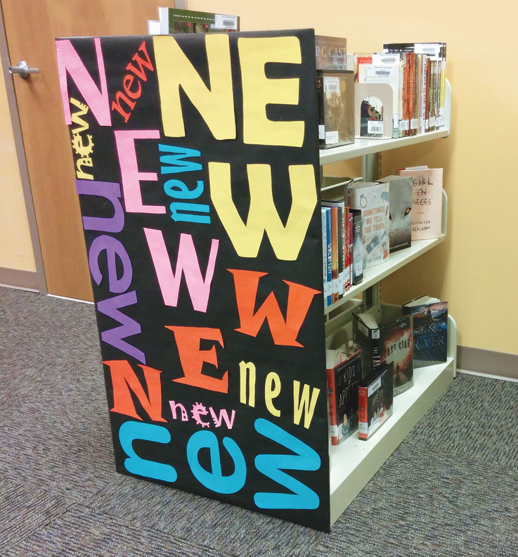 |
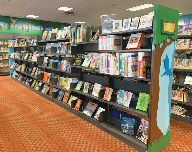
CLEAN AND CATCHY These real world library displays illustrate core precepts of visual merchandising. Top: At Mahwah Public Library, NJ, a traditional tall shelf becomes a showcase by turning items face out with the help of easels; visitors to the Iredell County Public Library in Statesville, NC, can hardly help but notice this selection of new titles. Top photo by Kurt Hadler; bottom photo by Kathy Dempsey |
Ohio’s TLCPL incorporates merchandising as it renovates its buildings. The refreshed structures have seen circulation numbers rebound. When Fiscus arrived at the library in 2016, many of the spaces had not been changed in more than a decade. By creating a map of how patrons were using the library, she was able to rearrange furniture and create walking paths, providing multiple merchandising opportunities.
“You cannot expect user habits to change overnight,” cautions Fiscus. “Your usual customers will come in and see the change, and may even be put off, but they will begin finding stuff that they have never seen. And they’ll tell their neighbors about it. It takes time. But the impression users have when they come through the door will be instantaneous.”
LESS IS MORE
David Vinjamuri, assistant professor at New York University and president of ThirdWay Brand Trainers, has conducted space audits at more than 20 libraries. The biggest mistake, he reports, is trying to put too much stuff in an inflexible space. Overcrowding doesn’t improve the patron experience but instead makes it more difficult to find items of interest.
Issac Pulver, the director of the Saratoga Springs Public Library, NY, equates crowded shelves with the experience of going to a hardware store and being confounded by the myriad selections of nuts and bolts.
“It is important to help narrow down people’s choices,” explains Pulver. “It can be overwhelming to look at a bunch of spines on a shelf. When I was at the Queens Library in the 1990s, the trend was to make libraries look like bookstores. Circulation skyrocketed when people’s choices were narrowed down, and things were displayed attractively.”
While it may sound counterintuitive, fewer items displayed properly leads to improved circulation. When Anythink Libraries renovated two branches, it reduced its collection. The result: a dramatic increase in circulation. At the York Street branch, the collection size decreased by 13 percent, while circulation increased by 51 percent. And at the Perl Mack branch, the 13 percent reduction in the size of the collection resulted in a 79 percent increase in circulation.
Just as important as regular weeding is reducing excessive visual noise. Fiscus recommends routinely culling external flyers, and setting and enforcing guidelines for internal flyers and marketing materials. She also suggests leaning into the library’s brand with consistent use of brand colors. While it may seem boring to staff, patrons and others will recognize it.
THE ART OF DISPLAY
A recent visit to the Guilderland Public Library, NY, stopped me in my tracks. Ahead of me was a glorious display of an image of singer/songwriter Lizzo, claiming to be “100% That Book,” accompanied by a robust collection of books celebrating black lives, different body sizes, and women. By riffing on a pop culture icon, the display tapped into the energy, enthusiasm, and advocacy of the artist referenced.
When thinking about book displays, Fiscus, Ledden, and Vinjamuri all recommend extending the “less is more” approach beyond collection size. Reduce visual clutter, and celebrate white space, which gives the eye a chance to rest. The Rule of Three posits that items displayed in threes are more visually appealing than other groupings. Smaller displays with fewer choices are more effective than large, complicated installations. “If you make a display overly fancy with too many props, people view it as a museum display,” says Pulver. The result? People are reluctant to take the material. The same principles apply to mobile locations—both bookmobiles and pop-up libraries.
Vinjamuri suggests librarians visit a local boutique that has excellent displays, and ask to talk to the designer for tips. Library workers can also start by simply spending time in retail spaces, identifying favorites and noticing how products are merchandised. And while merchandising in a retail context may give some pause due to the economic and environmental impacts of overconsumption, Pulver points out that in libraries, the opposite is true. “The more we share, the less people have to buy.”
Even without retail inspiration, anyone should be able to put together a simple display by grouping attractive books face-out in odd-numbered combinations. Include multiple copies of a title when possible. “When people see multiple copies, they think popularity,” says Fiscus. “If you have ten copies of the latest James Patterson, pull them from the shelves and make a display.” Vinjamuri reports that the Seattle Public Library creates displays of 50–100 copies of a single title, similar to what shoppers might experience at a bookstore.
 |
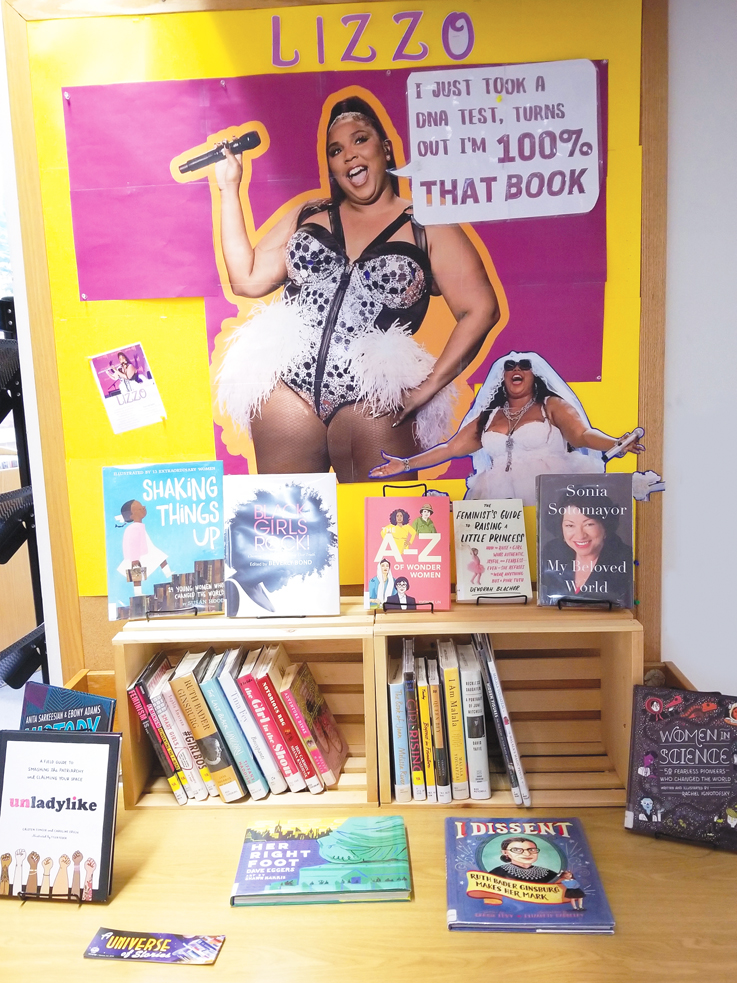 |
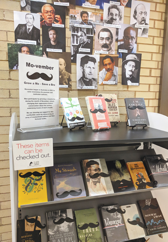
DISPLAYS TELL A STORY Top: At the St. Louis Public Library, MO, book covers offer a display where shelves don’t fit. Bottom: A display featuring pop icon Lizzo spotlights positive portrayals of women and girls at Guilderland Public Library, NY. Photos by Erica Freudenberger |
“If displays don’t look overly full, people are reluctant to take them out,” explains Pulver, who created retail displays before becoming a librarian. It’s all about striking the right balance—enough material to entice people with a relatively simple display that’s compelling, but not intimidating.
Fiscus suggests, “Ignore all of the instincts…to include props and cut-outs to make it more interesting. The best thing is to put it in a neat display, ordered, and follow a basic pyramid design.” She points to eye-tracking studies, which demonstrates the power of simplification. “Unappealing displays are rejected by our bodies,” explains Fiscus, “And if things are too busy, it’s unappealing.”
For Fiscus, a successful display incorporates five rules: It creates a visual pyramid, utilizes straight lines to draw the eye, showcases titles by displaying them face out, is balanced and symmetrical, and eschews props. She recommends highlighting the nonfiction collection. “Create a display of beautiful cookbooks, and watch them fly off the shelf,” recommends Fiscus.
FRESH FINDS
New displays capture people’s interest. To do so, “staff needs to be in tune with both the displays and their customers,” says Ledden. “If you put out a display, and after a week no one has touched it, it’s time to replace it. If you have a display and things are flying off of it, keep it stocked.”
What counts as new may be different for users than for staff, however. Consider how often patrons who use the displays visit the library. “The statistic that I like to point out is the average library customer comes to your building four times a year,” says Fiscus. “Patrons usually borrow two to three books each visit, so that’s ten to 12 books, tops. Books remain new to patrons for far longer than for librarians. Find a significant area for new books, and keep the books there for a full year to allow people to see what has come in.”
Displays also provide an opportunity for library staff to unleash their creativity, building displays of topical, memorial, and award-winning books. Dempsey recommends skipping holiday or seasonal displays, and instead showcasing underused collections—what she refers to as invisible services, such as databases, ebooks, and e-audiobooks. “If someone is looking for books on tutoring or homework help, put a sign that says, ‘Did you know we have a lot more information on this topic that’s electronic?,’” says Dempsey. “Check at the desk, and we’ll show you how to access that information easily.” It’s also a way, she adds, “to stop the patron comments we hate to hear: ‘Oh, I didn’t know you had that,’ or ‘I didn’t know you did that.’”
With any display, be sure to let people know that they can borrow items from it. Both Pulver and Dempsey recommend creating signage that encourages people to check out material on display.
DESIGN ON A DIME
Merchandising doesn’t have to be expensive. It can be as simple as weeding to create space for more items to be face-out. Vinjamuri recommends windowing displays, an effect created by clearing eye-level shelving throughout the stacks, and displaying three books face out on each of the shelves. The result is a less-cluttered space, highlighting attractive book covers that draw the eye—and patrons—to the collection. He also suggests taking note of everywhere people sit, and making sure everything that falls at eye level is displayed face-out.
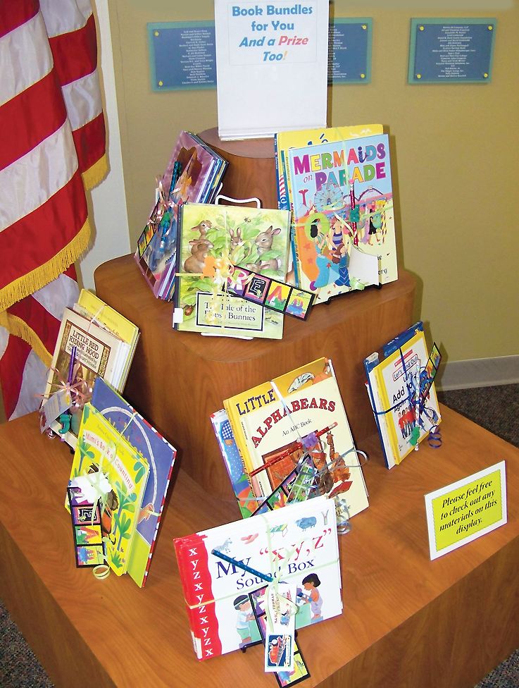 |
PACKAGE DEAL Clever merchandising can mean grouping your offerings in a new way. At Baltimore County Public Library System’s Rosedale branch, staffers created “book bundles” by tying together books, a bookmark, and branded pencil, helping busy caregivers to speed transactions and increasing circulation. Photo by Kathy Dempsey |
While simple props like acrylic cubes and easels can make creating displays easier, there are ways to reduce those costs. Pulver visits closing businesses, purchasing display items at a fraction of the usual price. Fiscus works with a local plastics business to create custom items that are much less expensive than purpose-built displays. Dempsey suggests contacting teens working on service projects to develop library-specific displays.
“Most of the overly designed fixtures that you can buy ready-made are not versatile,” says Fiscus. “You can do amazing things with just a flat surface. Invest in merchandising tables, and acrylic easels and fixtures.”
She recommends starting with what you have. “If you have good, flat space at the circulation desk, do a micro-display,” says Fiscus. “If you have flat wall endcaps, invest in some book holders for the end of those, and keep them well merchandised—it’s perfect for staff recommendations.”
Vinjamuri suggests considering placing displays in areas used for programming. “How many board meetings happen in rooms that don’t have materials on display?” he asks. “You’re always trying to get one type of patron to be another type of patron. If someone comes for a program, you want them to borrow material.” Placing curated materials in programming space allows staff to “cross-merchandise your library.”
EVERYONE'S JOB
Depending on a library’s resources, responsibility for merchandising may involve teams of people—something Vinjamuri encourages. He recommends training the entire staff so that anyone can take responsibility for replacing books in displays, or ensuring that end caps have attractive titles available. He also recommends asking patrons questions about displays.
At Anythink Libraries, the staff has a curated list of titles to use in displays, so anyone can quickly restock them. While this requires preparation ahead of time, Ledden points out that planning is an essential part of the process. The staff is trained in merchandising and has a set of guidelines to follow. “Some people gravitate toward this more than others,” she notes. “Everyone should have basic training, but there are others that love to come up with fun, creative displays that are reacting to what’s going on in the world.”
Ledden ties visual merchandising into a larger strategy that focuses on multiple touchpoints to reinforce the library’s message. What’s happening inside the library building should be reflected on social media, the library’s website, and in programs.
This holistic view of merchandising allows for a sense of discovery. While the idea of advertising can feel antithetical to what libraries stand for, giving patrons visual cues about what they don’t yet know they want is in everyone’s best interest. Not only does smart merchandising lead library users outside of their usual comfort zones and bring hidden treasures a wider audience, it allows staff to get creative and share their interests, which can build a closer relationship with the people they serve.
Good merchandising doesn’t require dedicated personnel or expensive tools. A sense of fun, a few basic rules of thumb, a willingness to prune, and genuine enthusiasm for what the library has to offer will showcase a library’s collection, boost circulation numbers, and surprise and delight patrons.
Erica Freudenberger is outreach consultant, Southern Adirondack Library System, Saratoga Springs, NY, and a 2016 LJ Mover & Shaker
RELATED
ALREADY A SUBSCRIBER? LOG IN
We are currently offering this content for free. Sign up now to activate your personal profile, where you can save articles for future viewing


Add Comment :-
Comment Policy:
Comment should not be empty !!!