Design Trend: Inside Out | Year in Architecture
Cues from the natural landscape come inside, seating and programming go out, as libraries continue to connect indoors and out.
DESIGN TREND: Inside Out
Cues from the natural landscape come inside, seating and programming go out, as libraries continue to connect indoors and out.
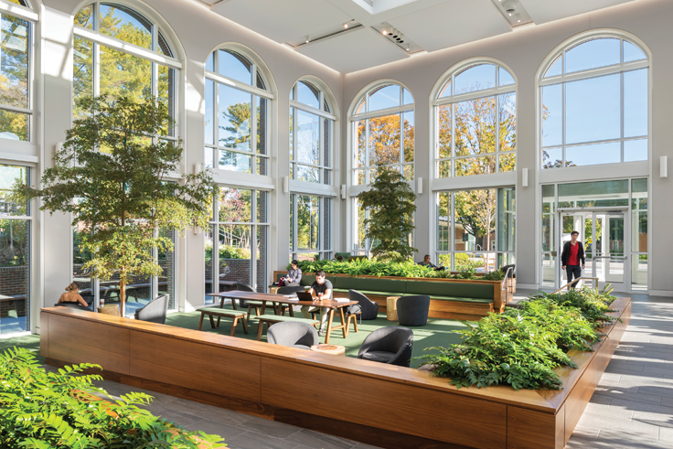
1. A colonnade brick facade conceals a light-filled atrium housing a sunken seating area with built-in benches and full-sized olive trees at the Commons at Horn Library, Babson College, Wellesley, MA, part of the new 10,000 square foot Commons library addition. This indoor garden also hosts a café and a balcony on the second floor that overlooks the atrium. CREDITS: Finegold Alexander Architects, architect; ©Anton Grassl Photography, photo
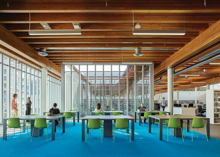
2. The Billie Jean King Library, Long Beach, CA, brings light throughout the floors with floor-to-ceiling window walls and a glassed-in courtyard, offering a well of light and visibility through the floors. CREDITS: Skidmore, Owings, & Merrill, architect; ©Benny Chan, Fotoworks, photo
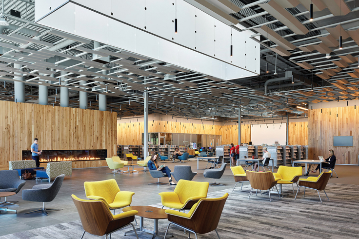
3. KS’s Olathe Indian Creek Library’s 46,000 square foot remodel introduces warmth to its rehabbed retail structure by bringing light in through a transparent storefront facade; skylights and a sunshade system bring dappled light inside. CREDITS: Group 4 Architecture, Research + Planning, Gould Evans, architects; Michael Robinson, photo
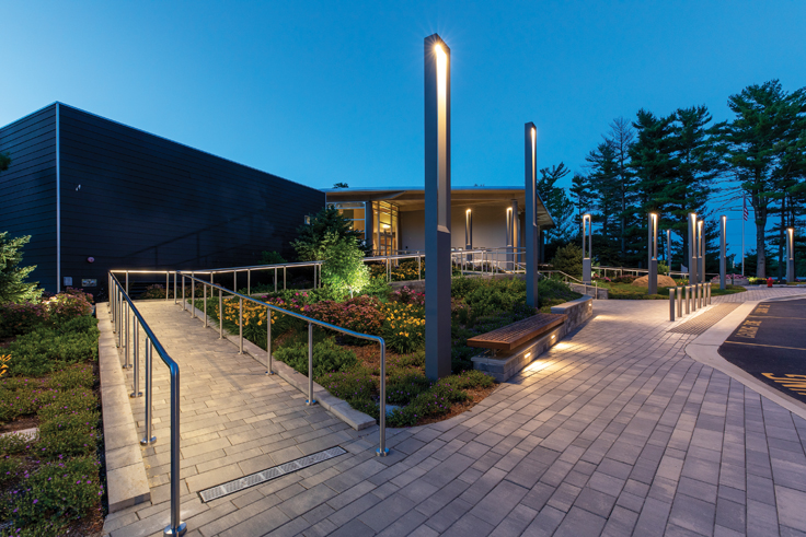
4. The Wauconda Area Library, IL, expansion created a 15,000 square foot exterior plaza that features an extra-wide sloping staircase up to the main entrance, a meandering accessible path with seating nestled in lush plantings, and plenty of lighting to maintain a welcoming presence into the evening. CREDITS: Product Architecture + Design, architect; McShane Fleming Studios, photo
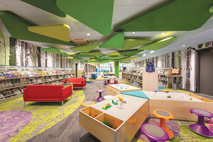
5. The Carol Stream Public Library, IL, brings whimsy to its children’s area with felted green triangular panels that sprout from a green-clad pillar anchoring one end of the floor. Biophilic yellow, pink, and greige carpet panels offer a lush landscape for play. CREDITS: Product Architecture + Design, architect; McShane Fleming Studios, photo
RELATED
ALREADY A SUBSCRIBER? LOG IN
We are currently offering this content for free. Sign up now to activate your personal profile, where you can save articles for future viewing


Add Comment :-
Comment Policy:
Comment should not be empty !!!